Huawei OOBE Redesign
Huawei faces complains because of its software, and there is a high return rate in the U.S.. To grow U.S. market, there was a need to help new users transfer to Huawei phone and create a trustworthy experience and brand. in this project, as a UX designer, I worked on improving EMUI (Huawei OS) onboarding experience to decrease drop off rate and increase user satisfaction during onboarding.
03 - 06, 2018 @ Huawei
Solution Overview
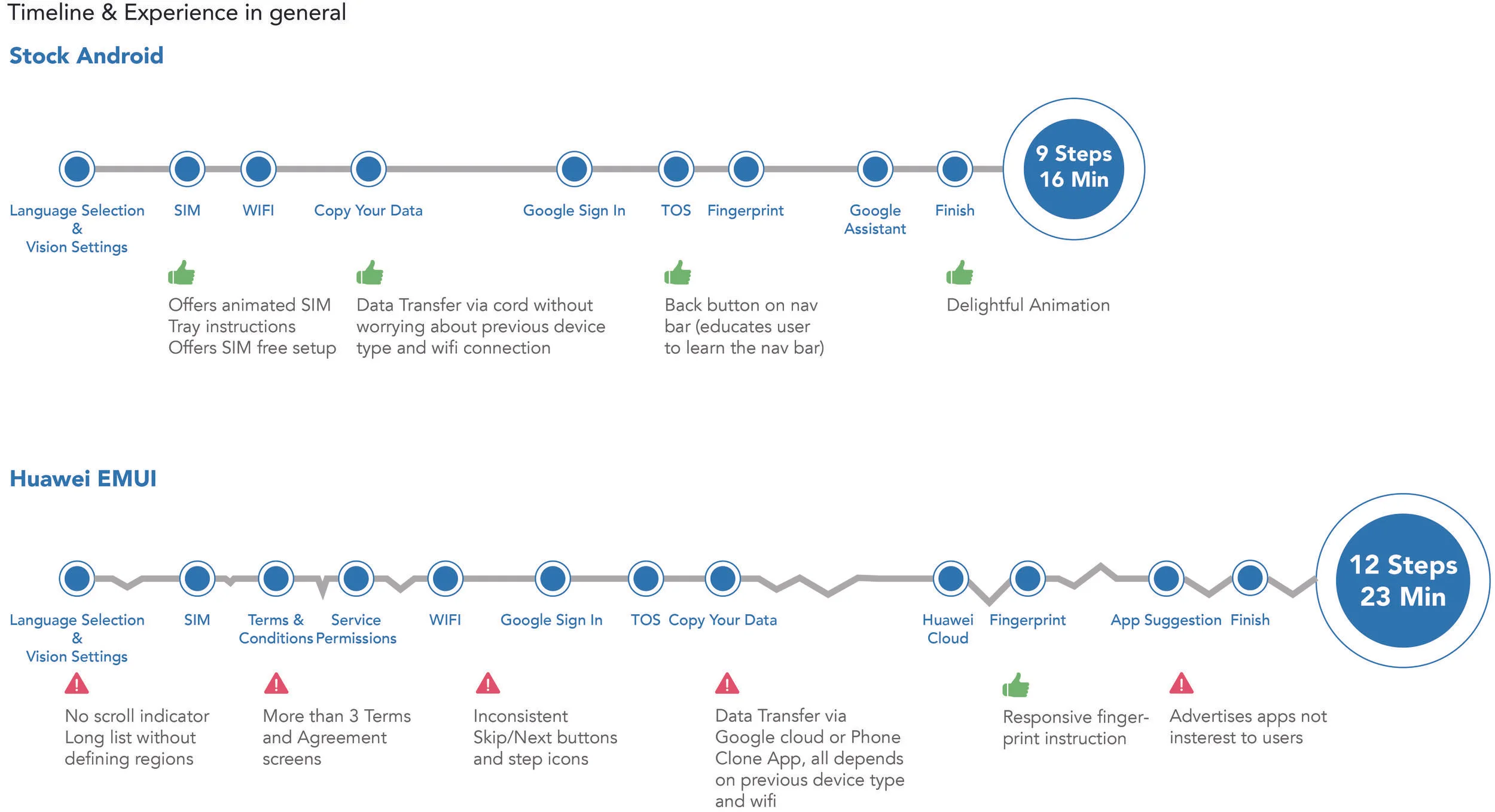
What we didn't do for our users?
To quickly surface things currently missing, I compared Huawei onboarding with Android’s because Android as the top one mobile system in the U.S. is well supporting 54.1% of total U.S. users, and they know more about the western users. I spent the first a few weeks on analyzing how each experiences is good or bad, overall smoothness and the time consumption.
What do users think about us?
I also interviewed some users specifically about EMUI Onboarding experience. The goal was to understand their thoughts on EMUI, and validate our assumptions. I observed them going through the onboarding and asked reasons of their behaviors to collect both quantitative and qualitative data. Then I transferred all the meaningful insights to opportunities.
Problems & Opportunities
After deeply researched users' thoughts on onboarding, I found that these problems specifically bother users:
Screen redundancy (seeing repetitive screens); confusing user flow logic (seeing unexpected screens); inconsistent information architecture; misleading wording and long text; and unclear impression to Huawei phone.
Our redesign will fix those problems as a fundamental step toward improving the experience.
Ideation…
Our team put the insights onto the affinity wall and started the ideation with 2 rounds of infinity diagramming. Every one generated ideas that addressed users' pain points reflected in the previous insights. Intensive communication with PM and engineers in HQ was involved. I picked some tangible approaches and evaluated them based on their impact and user expectation, before I moved onto visuals.
Grid System

Design Highlights
1. Improving user flow logic & efficiency
User flow is one of the biggest problems I found through user research. I spent a few weeks to tweak the flow, in order to provide intuitive sequences. I grouped the flow problems into three categories: screens that didn't eliminate redundant choices for users; screens that appeared too early to be in Setup process; and screens with low importance or even being bothersome were in high priority level.
Changes we made on the current whole onboarding flow
Focusing on "Data Transfer" approach
Beyond that, I focused on defining the best data transfer approach. There were different methods being offered to transfer data, such as Google Cloud, Phone Clone app and NFC. They all have different benefits. After discussing with PM, I decided to prioritize: Google cloud backup for Android users, Phone Clone app for previous iOS users.
2. Clarify screen relationship & indicate updated status
The current screens are not really responsive in terms of new status a user has been set up, so it's confusing to users whether they did enter things correctly. I designed responsive headers for all the primary screens and secondary screens. Headers on the secondary screens also indicate which specific sections they are at.
3. Exploring Data Transfer visual representation
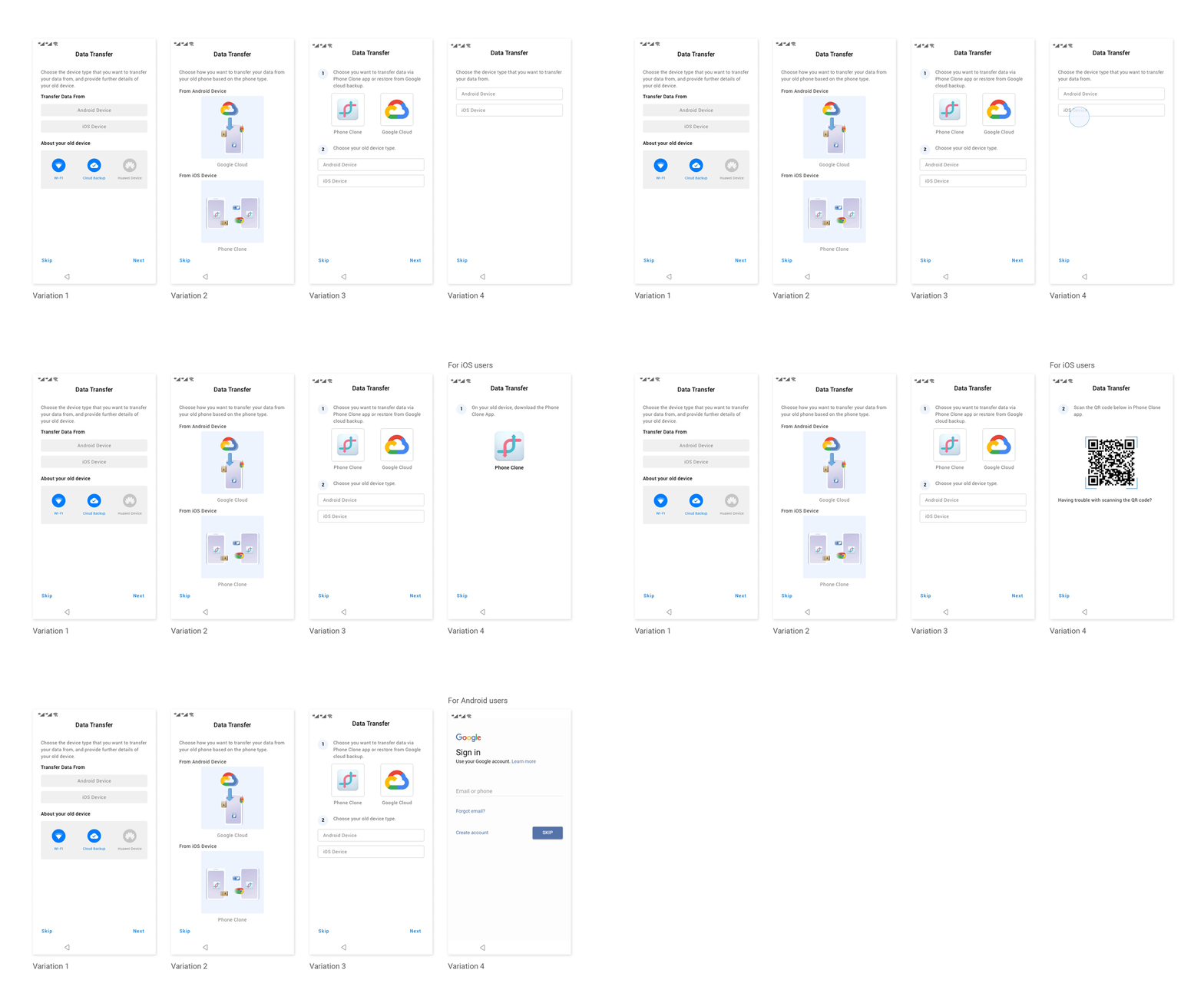
Since a user from different phone type gets different options, it's important to help them choose the right one and understand how it works. I explored a few representations of them and different user-interface interactions to help the user understand each option and find what they need quickly.
Exploration for representation of Data Transfer
I went with the last one because it only has one command once, which decreased a user's cognitive load. Users stated that they prefer to get to the right option without worrying about how it works. It has the least visual clutter and effectively leads user to the transfer option works best for their cases.
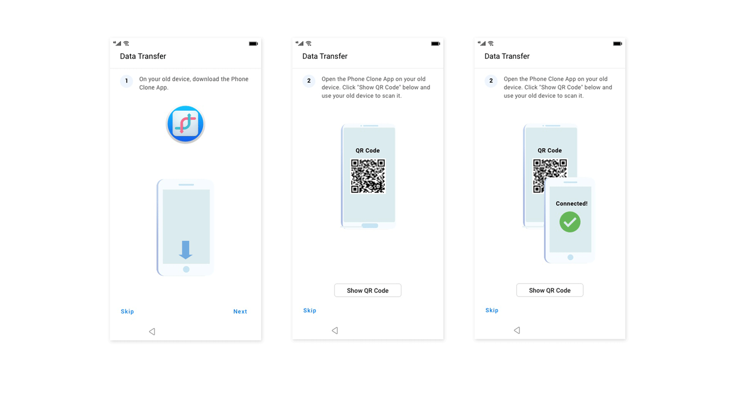
Animated Instruction
Many new users struggled with this step, because this page only shows a QR code and some heavy text now. They were unfamiliar with QR codes, which Huawei uses for creating a network connection between the old and new devices. My goal was to show not tell the new users on how to transfer data.
4. Creating a new interface that easily transits contents
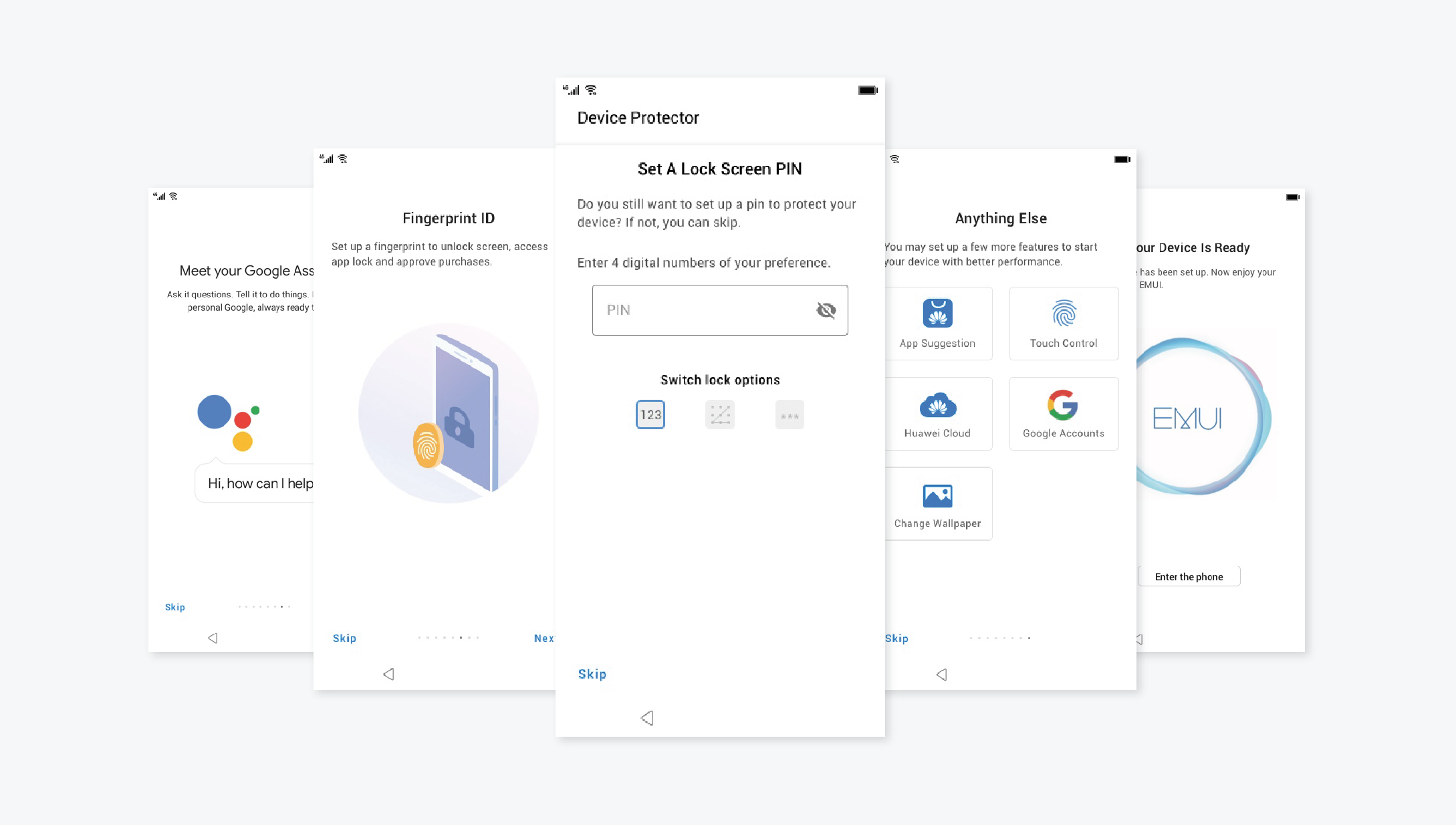
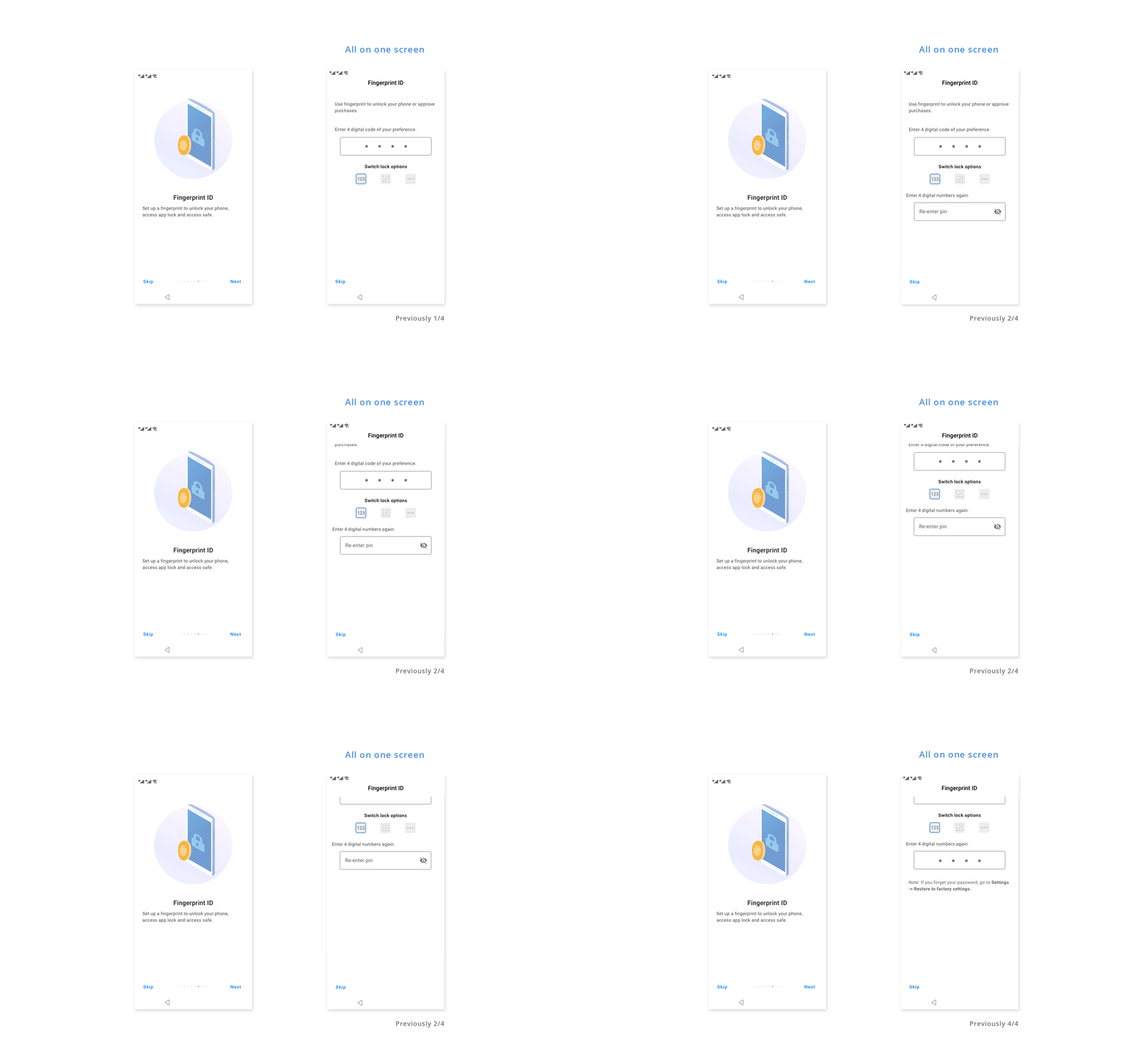
After printed and hanged all the screens on the wall, we realized there were many screens for Fingerprint. Although user will only focus on one field each time, I still thought user doesn't need to go through four-page transitions.
A general approach of screen transitions when confirm passcode
I was inspired by how chatbot conversational flow loads contents without transit to another page, so user always has a context of previous content. I made password input, password confirmation and the short note on the same screen. So four screens became one. It turned out to be unnecessary because of the low possibilities to go back to the first input field, as well as the change to vertical scroll from horizontal scroll.
The new approach that saves steps when confirm passcode
User Testing & Iterations
I collected both quantitative and qualitative feedbacks. I tested the prototype on 6 mobile users. I observe their onboarding process, with a specific focus on: overall time use (average 5 min), setup completion rate (average 78%), and asked their satisfaction score (average 9 at a 0 to 10 scale) and any feedbacks. To measure the improvement we made, I also invited people who did the initial study with us.
The feedback I received include:
Big improvement on navigation, with clear indication and consistent gesture for going back and proceed;
No redundant screens;
The password input method with a conversational-like-flow is not necessary;
Our design was well received in general, we got 8% improvement on user satisfaction, 17% increase on setup completion rate, and 25% decrease on time spending.
What i learned
Research and testing need to be more contextualized
We realized it can be quite different when setting up user's own phone, especially to decide if they want to transfer data to the new phone, from a testing scenario. Otherwise the result can be inaccurate when running in the market.
Early engineering involvement is necessary
We encountered problems when we iterate the data transfer flow. If we had involved engineering resources earlier, we can save our time to better develop the flow.


