WeVideo for education
Streamline video editing and education experience for teachers

Design opportunity
WeVideo is an online video editing product. It’s a single-product for all types of users, including education, business, professional, and personal users.
Since we have over 50% education users, the product needed to better serve for education needs.
The dashboard in the old product: create videos from new or scratch
MY ROLE
Under the initiative to design the new generation education experience, I led the design effort, including product design, visual, and interaction design.
I collaborated with Product Manager, Product Designers, a Content strategist, Engineers, and stakeholders.
Timeline: 05, 2020 - 01, 2021
User study
TARGETING USERS
K12 mainstream classroom teachers are the main users for this project because they play a key role in testing new EdTech products with their classes.
What are some main pain points for teachers to use the old WeVideo?
To understand user pain points, I interviewed teachers who use WeVideo to teach various grade levels of video classes. I found out that WeVideo was not easy to use because of the reasons I synthesized:
It's hard for teachers to locate student videos because it's mixed with the teacher videos.
Teachers can access student videos that they created in other classes.
Teachers spent time helping students create new videos.
AUDIT TASK FLOWS
Take a holistic look at the current flows
I started with auditing the current user task flow to see how I could simplify the flow towards the user goals. Based on what I learned, I was able to identify five tasks:
The tasks focused on both instructional video creation (tasks 1 & 2) and student-related tasks (tasks 3 - 5).
I concluded that the complex creation setup and mixed-purposed projects are the main problems in the old experience. Therefore, I aimed to design:
A simple flow for teachers to quickly create instructional videos.
Easy classes and projects management.
An easy way for teachers to review students’ assignments.
Problem statement
How might we help K12 teachers organize student work and create instructional videos?
Introducing WeVideo Classes
By merging “in real life” (IRL) experience and digital experience, our new product — WeVideo Classes, offers familiar experiences. It lowers the barrier for teachers to assign and review video activities and gain more control over class management.
RESULTS
It turned out that teachers enjoyed the WeVideo for Schools! Results we observed within 12 weeks after teachers signed up 🎉🥳:
• 40k videos created by teachers. (42% increasement compared with the old product. )
• 76% assignments got reviewed
• 5.9% teachers converted to EDU plan
• Not enough growth on the number of schools with at least one WeVideo teacher.😌
👇There’s not enough growth on the new users, so I realized that I focused on existing user needs. In the next project, I designed an assignment idea library that helps new teachers connect video activities to their instructional goals.
Key taskflow 1
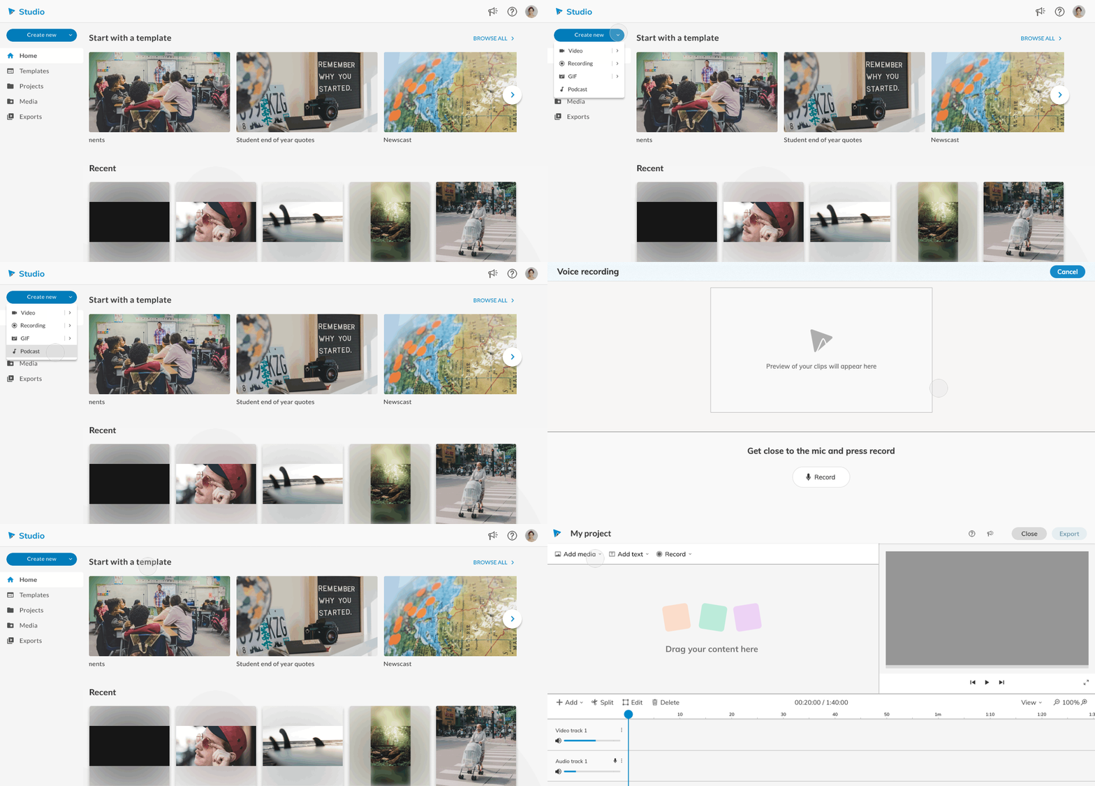
I designed an obvious entry point for creating new videos with a few bootstrap options: Video, Recording, GIF, Podcast and starting from a template, so the teacher can quickly jump into a voice recording screen without having to look for the “Record” buttons in the editor.
A history teacher, Kamila, wants to record an announcement for her class.
Key taskflow 2
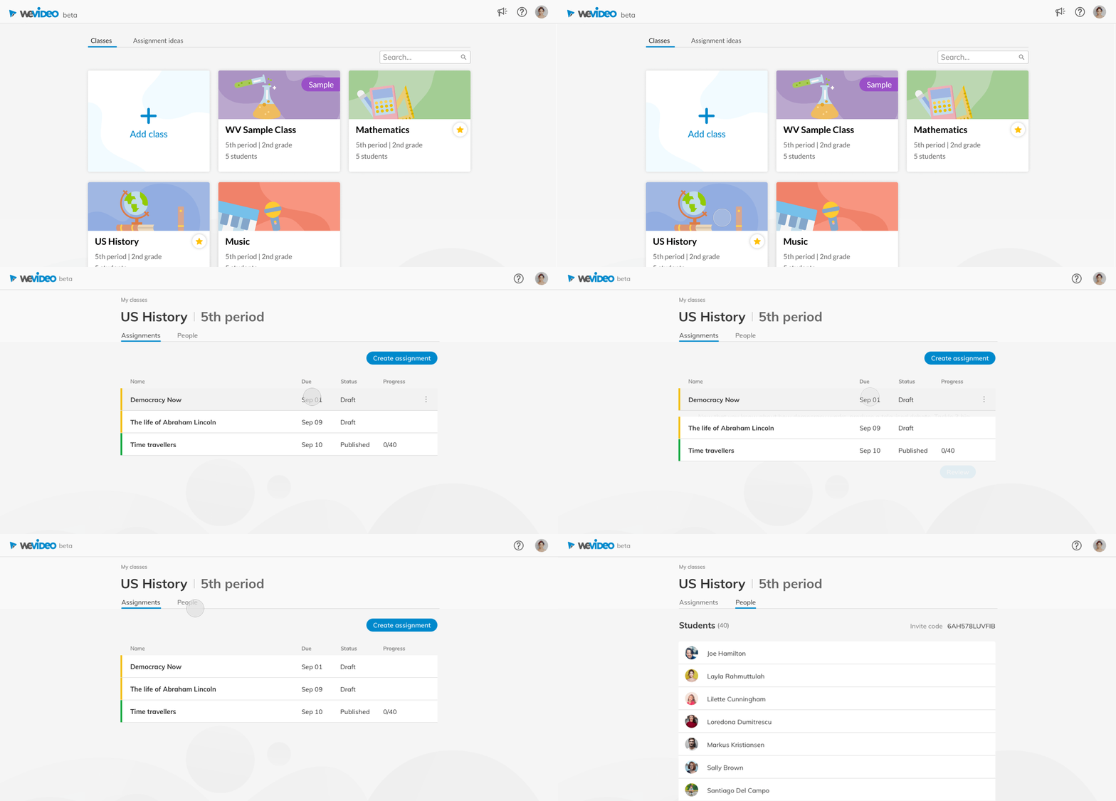
To easily access videos created by the student, I built virtual classrooms that contain assignments, which allow teachers to manage students and review their videos.
Kamila goes into the US History class to publish new assignments and manage her students.
Key taskflow 3
I worked together with another designer on this handoff flow. I emphasized the efficiency of the review experience by adding a left panel with student lists.
Rendered video ware available after Kamila’s students turned in the assignment. Kamila made a cup of tea and reviewed all her students videos at one go.
Key taskflow 4
To help teachers connect video-creation to their educational goals, I worked with content writers who are teachers to come up with an Assignment Ideas Library. The library provides various examples of video projects based on curriculum at different schools in different states.
DESIGN PROCESS
Reimagine the overall experience
I explored some directions, and I decided to have separate spaces for teachers' work and students' work because of user desirability, business viability, and technical feasibility. Some challenges influenced my decisions.
CHALLENGES
1. It's impossible to make structural changes due to the legacy code.
2. We had limited bandwidth to implement both student-creation and teacher-creation flow.
.

I worked with the PM together and I came up with three flows for Video creation, Class management and Assignment review. The video creation part was an improvement in the old product and I connected it with the new Classes space.

Creativity is the power
Teachers loved WeVideo because it’s the tool that inspired them and assisted them to achieve instructional goals. How might we help the teacher easily create instructional videos? I focused on designing an obvious entry point and bootstrap options.
We learned through surveys that the common formats for instructional videos included: video, webcam and desktop recording, voice recording, and GIF. I explored two ways to allow the teacher to quickly start creating while being able to pick up an existing project.
Left: added specific video types. Right: added a big Create button.
Final design: addressed consistency and decreased cognitive load.
Learn from the real classes experience
Since we decided that the educational video creation will be inside of classes and assignments, I started with exploring the classes and assignments experience, focusing on assignment cards and review video flow.
Assignment cards
I aimed to provide key information for teachers to create and track assignments. Considering that teachers may create various assignments with different level of details, I explored a few versions to offer them some flexibilities.
Low fi:
They both provided different levels of details for each assignment, including status, due date, and track progress. The hierarchy helps teachers to identify critical information and find the right assignment.
I decided to go with the second version, because there’s reduced amount of information. At this stage, the important goal for the teacher should be catching the progress, rather than identifying assignments.
Among the two hi-fi versions, 3.1 had an emphasis on the status. However, I received feedback through user testing that teachers can be distracted by the repetitive call-to-action buttons, especially they were less likely to open old assignments. Therefore I chose 3.2 as the final design.
Review videos
It’s important for teachers to be able to review students’ work at the spot. I found that some teachers would want to watch all the finished videos at once, while some like to review for whoever turn assignment in along the way. I explored a few versions of the review screen, in order to provide teachers flexibility.
I designed three versions that would allow teachers to review multiple submissions at one go, and be mindful how many videos are left. Both 1.1 and 1.2 provided easy navigation. I went with the wireframe 1.2, because it provided more information with taking advantage of the horizontal space.
Based on the wireframe and low fi design, I designed two versions of hi-fi that provided teachers a way to easily navigate through multiple submissions. I ended up with the 2.2, because it made more sense to me when the additional actions were below the video. The actions such as “Download” should happen after watching the videos.
Additional features I created for the WeVideo Classes experience
Building a connection between the old app and the WeVideo Classes
To address one of the important education needs, I designed an assignment information panel inside of the editor that can be accessed at any time. This provided students guidance during their creation process.
Kamila’s students are able to work in context with seeing the instruction and rubrics at any time.
I designed a feature that allowed teachers to add timely feedback to the students during the editing. This helped teachers track progress, and helped students make improvements.
Kamila saw one of her students being hesitated to proceed. She went into the student’s timeline and left a few feedback. So the student had more things to work on.
Future work
Crafting a holistic look and feel with design system
For keeping the product easy to use and the consistency of the work, we built the library for designers and engineers to work together. And we are constantly updating it.
Exploring upcoming features…and further address the teacher’s needs
I led the exploration on some of the upcoming features, including collaboration, Google Classroom integration, and more. My next step will be focusing on designing better bootstraps and building a connection to the curriculum.
Improving design for the right screen size and hand size
We observed how students use the product on their devices (mostly Chromebook), and found a few problems with screen sizes, their hand sizes, as well as the touch screen interaction.
My Learnings
Having a principle(s) to guide design strategies makes the process smooth and consistent with the goal. I formed a principle based on the user study, which served as a high-level solution. It helped me think through specific use cases and keep all the features easily aligning with the goals.
I learned how fun design truly is. And it’s important to get people excited about my ideas. I enjoyed the process because we worked with our users together. My micro-interactions delighted my team and users, so they were supportive of my ideas.


